Saturday, 28 March 2015


Make this image includes many tools involved, so a bit tricky to put into practice, but if you carefully consider seriously then it would not overly complicated, especially when in front of monitors available especially tasty and crispy snacks plus a cup of coffee bitter / sweet, hem .. .. will seem fascinating, violence linger long in front of the computer.

Okay let's get started ....
First Instance, Create Leaf;

In the Toolbox click the Freehand tool to make triangles for pointer clicks Freehand tool leaves the work area -> doubel click on somewhere else -> point at the start node to an end, and set the Shape tool to roughly resemble the shape of the leaves.
Create a box with the Rectangle tool and activate the Mesh fill tool add nodes to put a texture shadow color, then enter the results box on the object mesh leaves.
Give 50% transparent effect is the result as shown below;
Draw lines with the intent of the whole leaf leaf fiber and then replicated with press + on the numpad, slide to the edge of the leaf, then double click the Blend tool to let quickly and neatly arranged;
And holding the line on the edge of the leaves had been set on the edge of the leaf with the Shape tool and do not forget to press Alt + Z (Snap to objects) so that the line can be attached to the sides of the leaf edge.
The result is like this;
Create a box with the Rectangle tool and set texture color with Mesh Fill tool as Background
The second step Creating Water Drops
Create a circle with the Ellipse tool object and press Ctrl + Q to convert to curve and set a circle according to the leaf surface shape;
Give white color, clear outline of the Color Palette, and then adjust the transparency of objects circle the Transparency Tool in the Toolbox
Duplicate the circle and set the transparent effect on the other, making it a dark color.
Create object as shown below and adjust the transparency of the color with the intent of the effect of light.
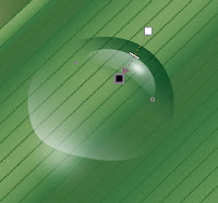
Duplicate again the circle object to press + on the numpad and then set the transparency and the large circle to be object shadow
Duplicate several times and adjust the size of the object with the Pick Tool .... finish ....
The end result is as shown below ...
If we want a little effect on the final result, then we design will appear more concrete with the following steps;
On the Menu Bar Choose Convert to Bitmap .... (but do not forget to copy your design first if there will be changes), then click on Menu Bar Effects -> Adjust -> Brightness / Contrast / Intensity ...
Then perform the command box to set the Brightness / Contrast / Intensity ... type -20, 20, 20 or set the sliders according to your creativity ...
The results are as shown below, and this is the image that is so, and can be displayed on your friends ...

In this CorelDRAW tutorial, we will learn how to easily add water reflection effects and realistic water ripples into any image. To create this effect with CorelDRAW is very easy and we can add it to any photo we like, even though the image we had no water at all objects in it. In this tutorial let us together create a water reflection effect and water ripple effect.

The following photos are original photos that will give us water reflection effects;


After the effects of water and water ripple reflection, the result will be like the picture below;


Step 1: Create a Background

for background, we create an object box with the Rectangle tool located in the toolbox, and we give a black color by clicking on the Color Palette on the choice of black.


Furthermore Import photos and put into position on top of the background black box.


Step 2: Duplicate and Mirror Attractions Photos


Then duplicate the transformations, this feature is located on the Menu Bar> Arrange> Transformations> and select the Scale and mirror or the short way we can press Alt + F9 on the keyboard and the docker command box set as shown below in;


After we set as above, the result is as shown below.


Step 3: Provide Transparent Effect On Photo Attractions

The next selection on the duplicated object image and select Transparency tool in the Toolbox;


Move the pointer over the object image and drag in the direction diagonal to the bottom, so it will create a transparent effect as shown in the figure below;


Step 4: Giving Water Ripple Effect In Attraction Pictures

To make the water ripple effect that could use the positioning features Ripple on Menu Bar> Bitmaps> Distort> Ripple select ...


Set the dialog box by dragging the slider and click preview to see the display temporarily, If it is felt suitable enough we hoped click OK.


So the final result will be like the picture below.


Make a magnifying glass effect in CorelDRAW there are actually bermacam2 way, but here we will make it the right way that is in accordance with the features provided to make the enlargement of an object in a specific section, we will discuss is to make the effect as the picture;


how to make it as follows;

we first create an object, it's up to you, what object would be enlarged, here I am making stellar objects, as shown below;


Create a circle object using the Rectangle tool in the Toolbox, place it anywhere


Next, circular object in the selected state / active Menu Bar -> Effects -> select Lens


Docker so it appears that it's on the right side of your monitor display, and select the drop down Magnify


Amount type = 1.2, then click Apply


The results are as shown below, because it will be given additional images then you must give a check in the Frozen aiming to create a new object then click Apply;


In addition in order to give a realistic picture we looked lop picture above (look on the internet, try to find a free image be safe) for that rim width equal to the object lop circle;


Give a Drop Shadow shadow effects tool in the Toolbox;


The end result, as pictured below, good luck.


Actually, the trick is very simple, depending on your imagination in a drawing to produce a near-perfect effect fire.


This time we draw it using Feature Mesh Fill Tool (M) ~ M in brackets it means to press M on the keyboard are directed to the feature / menu ~

Steps were as follows;

Create a box with the Rectangle tool (F6)


Make a sketch of the fire by using the Freehand tool (F5) or Polyline tool
Object boxes are colored black, and white berries fire object and delete the outline of her (right click on the sidelines with a cross (X) in the Color Palette.


Select the Mesh Fill tool (M), the grid size type W = 30, H = 30, the more you type, the more the grid is created, and try to learn what menu in the Property Bar to feature a Mesh Fill tool, there is a Transparency ... etc ... etc. ..


Give red yellow black as the color of fire on node2 that existed at the intersection of Grid and natinya will be created from the combination of the color spectrum, and then slide the node according to your imagination.

To add a Grid, click on the vertical or horizontal line, click Add and then the intersection or press + on the Numpad, it will create a new grid. and do not forget the edge nodes background color match with the color.


The result will be as shown below, the results are close to perfect. finished ... good luck ..

Tuesday, 24 February 2015


A graphic designer, also often referred to as a graphic artist, wears many different hats while using an equally diverse number of media to create numerous types of designs. Graphic designers work to visually convey a particular message or idea that has noticeable appeal and the respected profession is highly sought out for promoting and displaying a wide variety of products, activities, ideas, and communications.
Graphic design is used every single day in the world of advertising, including everything from books and magazines, health and personal care, food products, automobiles, clothing, computers, and just about everything else you could think of in between. Product packaging is a huge part of any type of business and requires the expertise of a graphic designer who understands not only the general marketing aspect of business, but also the client's main objective.
Working closely alongside the client, a graphic designer begins expanding upon an initial concept, asks pertinent questions as to the end goal, discusses budgets and deadlines, then agrees on the finalised design, fee and due date. Many designers successfully juggle more than one project at a time, allocating a certain portion of their time to each. Some duties of a graphic designer may include:
- Meeting or communicating regularly with clients to discuss the aspects and goals of a project.
- Staying abreast of the latest technologies in terms of computerised media and common design programmes such as Dreamweaver, Flash, Adobe Photoshop, and Quark Xpress.
- Designing a product from rough drafts, sketches and vague ideas while still knowing how to reach just the right audience.
- Demonstrating excellent proofreading skills while also showing high attention to quality and detail.
- Working with other professionals in the industry such as copywriters, photographers, marketing specialists, web developers and printers.
- Effectively managing time in order to meet deadlines while staying within budget constraints.
An experienced and knowledgeable graphic designer has the uncanny ability to take a general idea and turn it into a visually compelling product that garners not only attention but favourable results as well. Somehow they instinctively know when to use clean lines and muted tones and when to instead use vibrant designs with bold hues that grab your attention.
Graphic designers may work for themselves on a freelance basis or may be employed full time by someone else, whether it be a small organisation or a large corporation. If self-employed, a graphic designer must work diligently to market themselves and their skills in order to build their portfolio and client base as well as making continued learning a large part of their career.
The CSD, the Chartered Society of Designers located in London, offers a number of programmes providing graphic designers with the opportunity to pursue continuous professional development, or CPD for short. Designers can learn the latest in illustration, typography, corporate identity and interactive media design for websites and computers.
When working for a design firm or similar entity, the opportunity for advancement is definitely there in this exciting and ever changing field. Within just a few short years, one may progress to senior designer, obtain a management position such as creative director, or even venture out on their own or create a partnership with another like-minded designer.
While many of us can create something that looks good in Photoshop or attractive when spliced into CSS, but do we actually understand the design theory behind what we create? Theory is the missing link for many un-trained but otherwise talented designers. Here are 50 excellent graphic design theory lessons to help you understand the 'Whys', not just the 'Hows'.
Note: this article has been updated and dead links have been removed
  • "The kind of typography I'm talking about is not your typical "What font should I use" typography but rather your "knowing your hanging punctuation from your em-dash" typography."
    Visit Lesson
  •  
    3. Typography tips for graphic design students
    "What basic typographic advice would you give a third year graphic design student? I read the comments with great interest and here I’ve picked out a few of the most useful typography tips."
    Visit Lesson
  • "An extensive collection of terms and definitions that relate to typography."
    Visit Lesson
  • "It really does boil down to a judgment call. Usually, pairing type is done to create contrast, so, as DavidR points out, a good general rule is to not pick two fonts that are so similar they can be confused for each other at a glance."
    Visit Lesson
  • "There are quite a few terms thrown around with regards to typography. Hopefully this article will help you understand more about the world of typography."
    Visit Lesson
  • "Today we’re going to talk about web typography in terms of a recipe of four fundamental ingredients. If you’ve ever tried to cook a soufflĂ©, you’ll know how important the recipe is. Follow this recipe and your typography will rise up like…that’s enough of the culinary metaphors, let’s cook."
    Visit Lesson
  • "Fundamentally, the responsibility we bear is two-fold: first we owe it to the reader not to hinder their reading pleasure, but to aid it; second, we owe a responsibility to the typeface or typefaces we employ."
    Visit Lesson
  • "Well, what you will discover, is that learning just a little about the terminology will help you to have a greater appreciation for type; it will also help you to identify different typefaces and fonts — and that in turn will help you make better, more informed choices about the fonts you use."
    Visit Lesson
  • "One of the most under–rated elements of beautiful Web design is the subtle art of typography. Part of this, I know, is a lack of a solid font support for Web sites. But never fear! Today I’ll show you some quick things you can do to appear to be a type master."
    Visit Lesson
  • "The main idea behind grid-based designs is a solid visual and structural balance of web-sites you can create with them."
    Visit Lesson
  • "One of the larger problems in working with grids in web pages is that you often can’t do much about vertical proportions. Often your content is dynamic, so the best you can do is approximate."
    Visit Lesson
  • "A grid is a technique that comes from print design but easily be applied to web design as well. In its strictest form a grid is literally a grid of X by Y pixels."
    Visit Lesson
  • "There are quite a few terms thrown around with regards to typography. Hopefully this article will help you understand more about the world of typography."
    Visit Lesson
  • "Many of the pages that you see everyday have a grid. You may not see it but it is there, holding up the design, establishing structure, guiding the page elements."
    Visit Lesson
  • "Designers of all types (web, print, etc.) are constantly facing issues involving the structure of their designs. Web designers are increasingly turning to grids to control the structure of web pages, and grids have long been used extensively in other design mediums."
    Visit Lesson
  • "Grid systems bring visual structure and balance to site design. As a tool grids are useful for organizing and presenting information. Used properly, they can enhance the user experience by creating predictable patterns for users to follow."
    Visit Lesson
  • "Color theory encompasses a multitude of definitions, concepts and design applications. All the information would fill several encyclopedias. As an introduction, here are a few basic concepts."
    Visit Lesson
  • "If you are involved in the creation or design of visual documents, an understanding of color will help when incorporating it into your own designs."
    Visit Lesson
  • "With colors you can set a mood, attract attention, or make a statement. You can use color to energize, or to cool down. By selecting the right color scheme, you can create an ambiance of elegance, warmth or tranquility, or you can convey an image of playful youthfulness."
    Visit Lesson
  • "Color Theory is a set of principles used to create harmonious color combinations. Color relationships can be visually represented with a color wheel — the color spectrum wrapped onto a circle."
    Visit Lesson
  • "Colors often have different meanings in various cultures. And even in Western societies, the meanings of various colors have changed over the years. But today in the U.S., researchers have generally found the following to be accurate."
    Visit Lesson
  • "While perceptions of color are somewhat subjective, there are some color effects that have universal meaning."
    Visit Lesson
  • "Applied to web design, color psychology could offer a thermal map; an informative alternative to featureless blog calendars of archived entries."
    Visit Lesson
  • "Color is light and light is energy. Scientists have found that actual physiological changes take place in human beings when they are exposed to certain colors. Colors can stimulate, excite, depress, tranquilize, increase appetite and create a feeling of warmth or coolness."
    Visit Lesson
  • "Colors not only enhance the appearance of the item -- they also influence our behavior. You will do well to consider the impact that the colors you use will have on your target audience."
    Visit Lesson
  • "The principles of design suggest effective and pleasing ways to arrange text and graphics on the page as well as the arrangement of individual elements within illustration, logos, and the overall graphic design of a document."
    Visit Lesson
  • "Get a better understanding of the basics of graphic design by studying the elements and principles of graphic design that govern effective design and page layout."
    Visit Lesson
  • "The basic elements of design include colour, line, shape, scale, space, texture and value and these are the fundamental pieces that make up any piece of work."
    Visit Lesson

  • "Many of the underlying principles behind graphic design have been bypassed and the results are not as potent as they could be. In this short series, I want to help to fill-in some of those gaps and provide a better understanding of what it's all about."
    Visit Lesson
  • "To insist that, or to prescribe how, the history of graphic design need be taught in any particular way is to unnecessarily limit the field in both methodology and pedagogy."
    Visit Lesson
  • "I envision this text as an addition to the AIGA’s existing publication on ethics, which currently includes sections concerning our responsibilities to the profession and our clients."
    Visit Lesson
  • "The call-to-action button is an important tool in the user experience designer’s box of tricks. In this article I’ll give you a few pointers on providing effective ones."
    Visit Lesson
  • "The kind of typography I'm talking about is not your typical "What font should I use" typography but rather your "knowing your hanging punctuation from your em-dash" typography."
    Visit Lesson
  • "We interact with so many objects during our day that we often don’t notice that someone actually stopped to thing about how we were going to use items."
    Visit Lesson
  • "Among other things, we highlighted embedded video blocks, specialized controls and context-sensitive navigation. We also encouraged designers to disable pressed buttons, use shadows around modal windows and link to the sign-up page from the log-in page."
    Visit Lesson
  • "Web design consists, for the most part, of interface design. There are many techniques involved in crafting beautiful and functional interfaces."
    Visit Lesson

  • "This edition of Ask UXmatters discusses how to communicate and sell the UX message across all levels of an organization. Our experts share what strategies and tactics for evangelizing UX have worked for them."
    Visit Lesson
  • "In this post, we discuss some of the things the separate Generation Y from older generations, and how we can create a great user experience for both demographics."
    Visit Lesson
  • "This post suggests some ways to improve your site's usability based off of user feedback. These methods and programs will help you gather and act on user feedback."
    Visit Lesson

Unordered List

Sample Text

Sponsor

Featured Video

Find Us On Facebook

Powered by Blogger.

Popular Posts

Popular Posts

Recent Posts

Text Widget